

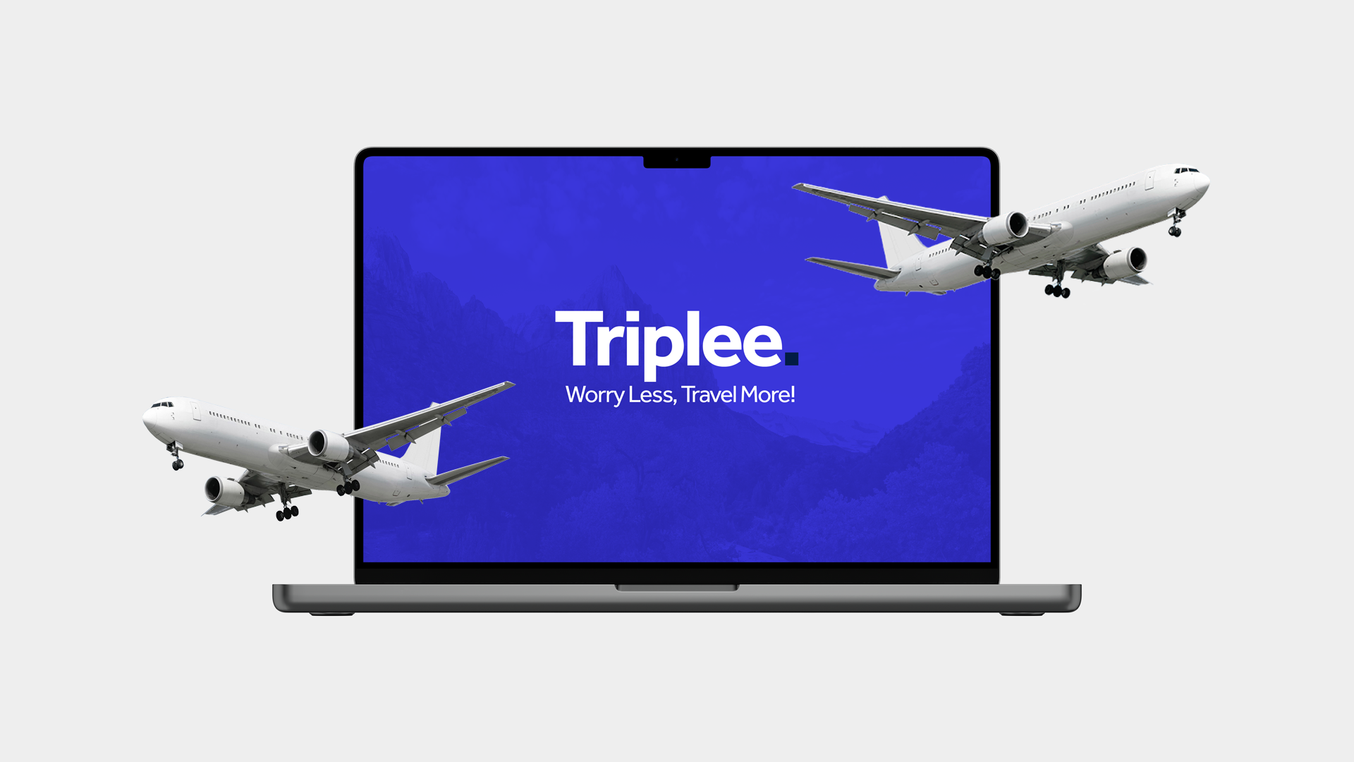
Project: Triplee
Role: UX Researcher, UI Designer
Role: UX Researcher, UI Designer
Duration: 4 Months
Tools: Figma, Adobe XD, UserTesting.com
Tools: Figma, Adobe XD, UserTesting.com
Project Vision
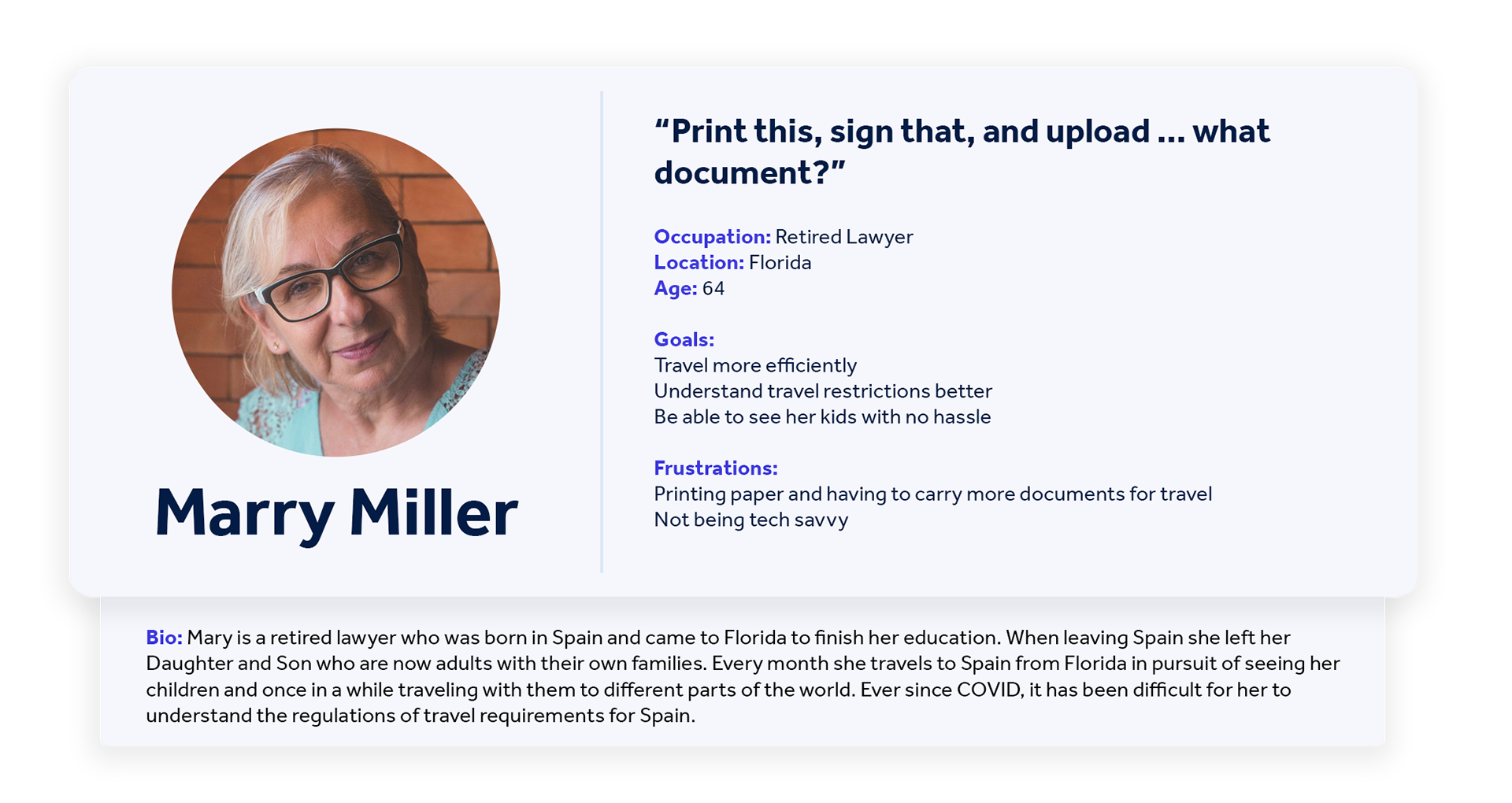
Ever since COVID-19 disrupted our traveling plans, it has been difficult to travel to specific countries because of the certain travel restrictions. Because of this people are afraid to travel in worries that they wouldn't be allowed in certain places because they don't meet the travel requirements. Triplee makes Traveling during the pandemic less worrying and more efficient.
Challenges
1) Create an easy-to-understand platform for all audience without having tech savvy skills.
2) Allow users to easily identify if they have been approved or denied entry to the selected countries.
3) Building a easy-to-use country search platform for those who are traveling or planning to travel.
2) Allow users to easily identify if they have been approved or denied entry to the selected countries.
3) Building a easy-to-use country search platform for those who are traveling or planning to travel.

The Research
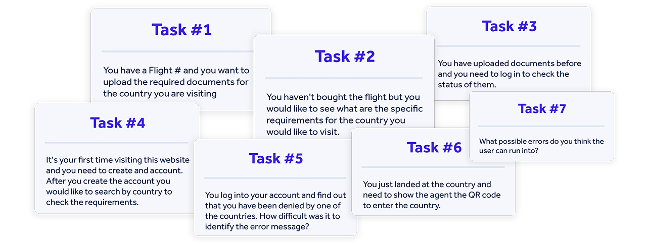
I embarked on the project with interviews both in person and virtually through UserTesting.com to understand 'how' and 'why' travelers were having trouble traveling during the pandemic. To reach a broader audience, I used UserTesting.com to have 3 users from age range 25-52 answer the test plan and interact with the medium fidelity prototype.


Competitor Analysis
I gathered information about the competition in order to define the basic features of Triplee.
What did I find?
- The biggest competitors are government website with poor user interfaces.
- They only showed requirements for a specific location.
- None of them have the usability to let travelers upload their documents before-hand.
What did I find?
- The biggest competitors are government website with poor user interfaces.
- They only showed requirements for a specific location.
- None of them have the usability to let travelers upload their documents before-hand.
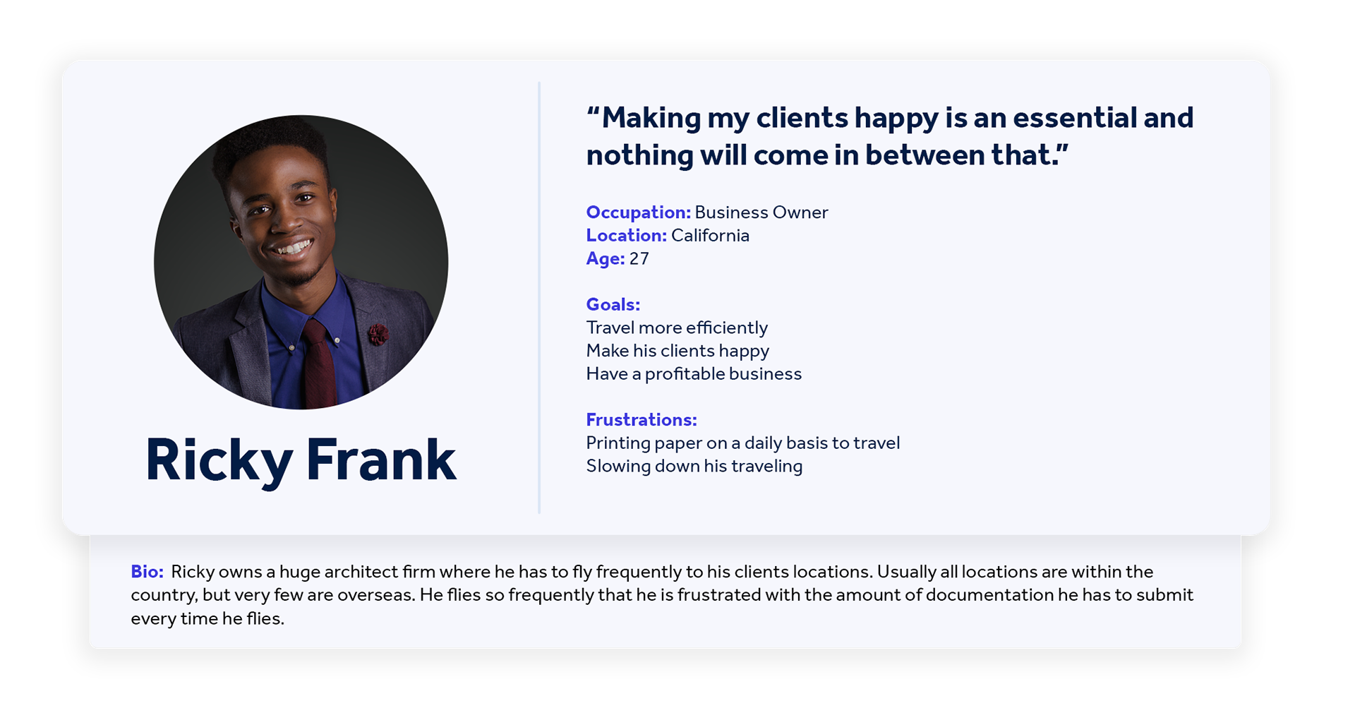
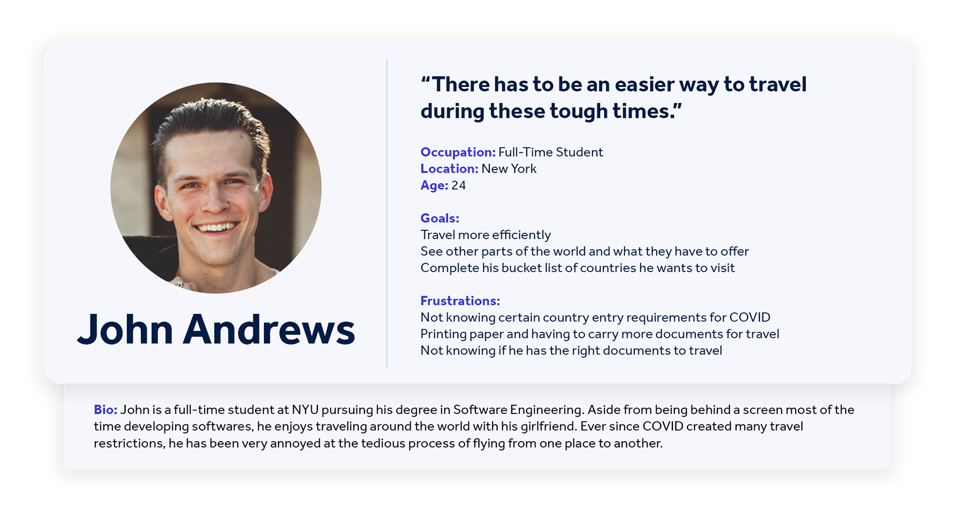
Meet the Users
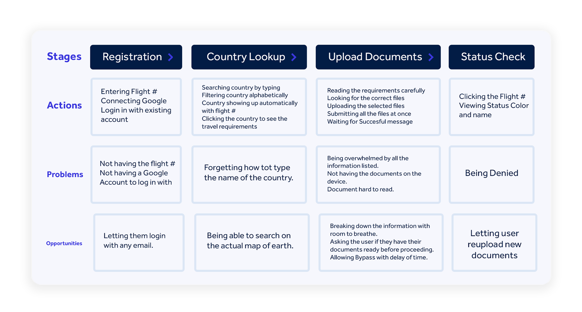
Journey Map
Design Phase
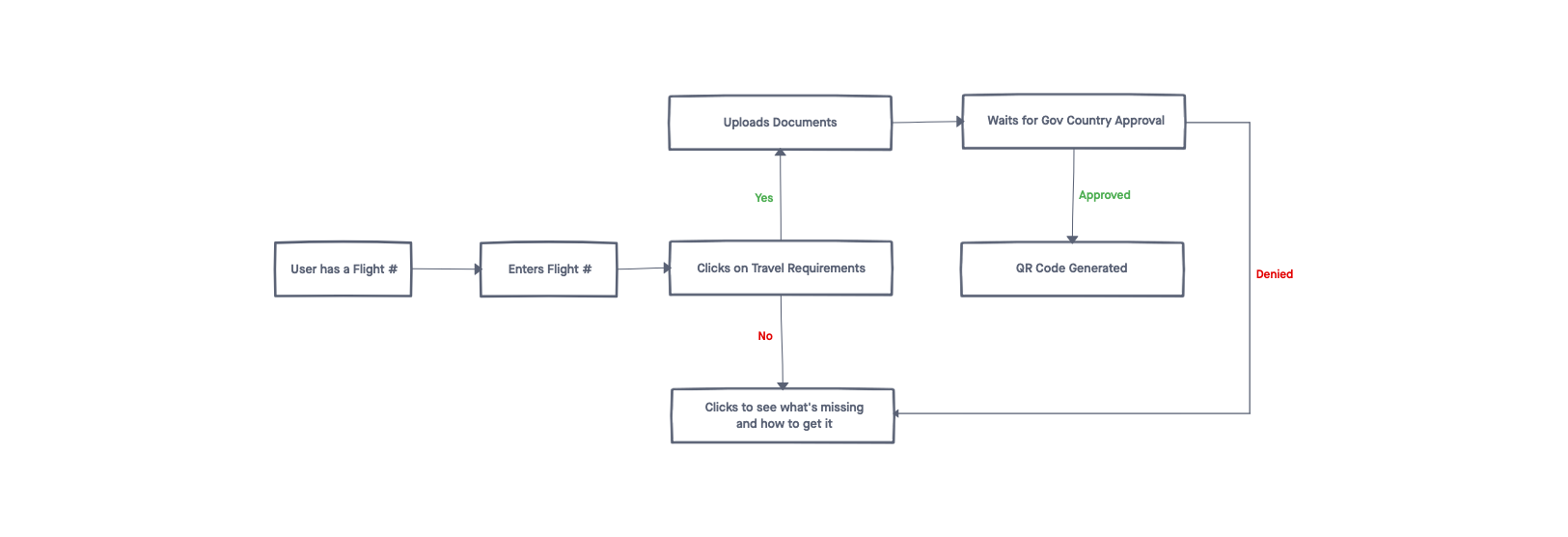
User Flow
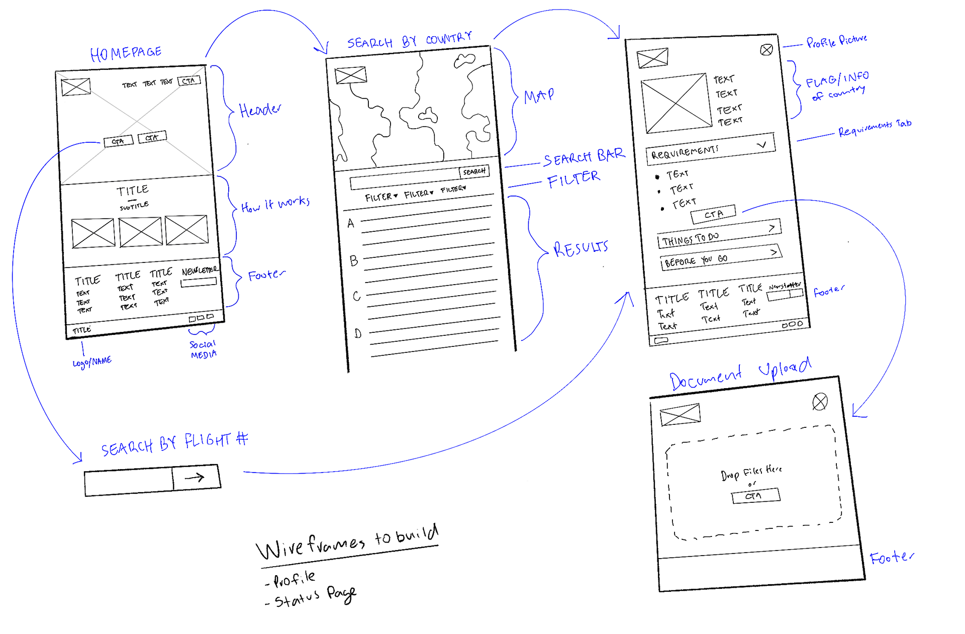
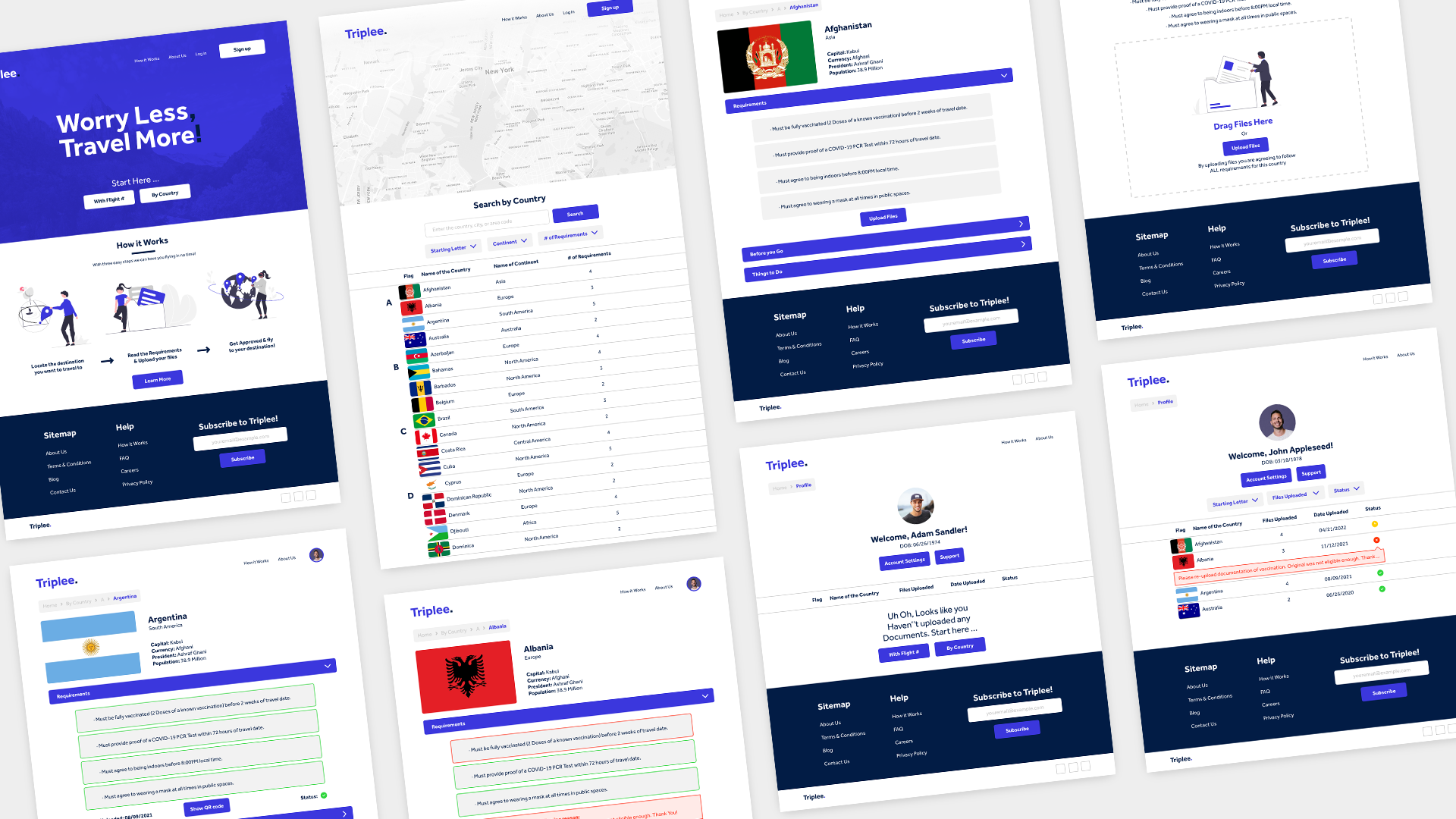
Low-Fidelity Wireframes
I usually start the design process with low fidelity wireframes. This is the way I iterate through many design options quickly. With my wireframes I was able to clearly define the basic features and main user journey of the app.
What can users do in the website?
- The users should be able to easily search the country they want to travel to
- They can filter the country based on requirements
- They can upload their required documents to the specific country
- They can check the status of their documents through their profile
- They can filter the country based on requirements
- They can upload their required documents to the specific country
- They can check the status of their documents through their profile
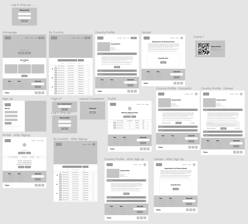
Medium-Fidelity Wireframes
With the help of UserTesting.com I tested this prototype with 3 users. After conducting a test plan and letting the users interact with the website with objectives I found out usability pain points:
Filtering Option? Although, all three users seemed to navigate the website easily, 2/3 of them mentioned how navigation can be much more easier if there was a set filter on results.
Denial Message? For the most part, all three users were able to easily locate which submission has been denied. One, pointed out how it would be more convenient to see the message on the profile page.
Offline Issues? The QR Code is easily available if you have an internet connection. However, what if you traveled to a country where internet access is not easily obtainable?
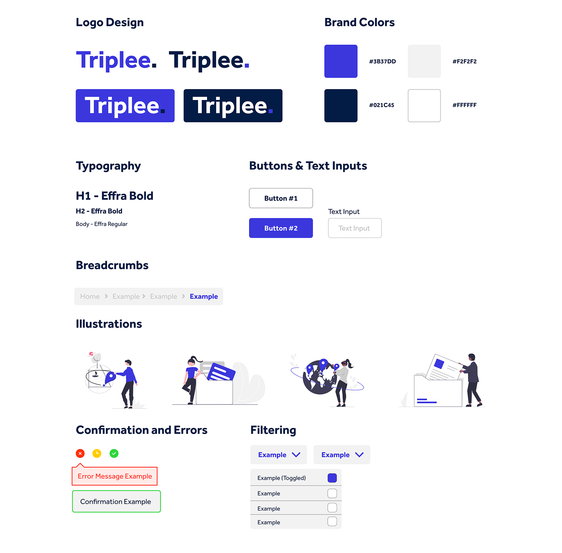
Design System
What have I learned from this project?
I really enjoyed working on this Pandemic Traveling project. The process of doing a virtual usability testing and reviewing the recording of users running into issues and giving feedback towards my design was amazing. Through research and testing, I learned that having a broad audience is important towards learning how to improve your user interface design. This is because some testers are not tech savvy and us as designers have to improve and design an easy-to-understand platform for all audiences.
5
Usability Test
15
Screens
2
Interviews
1
Product Designer